I just saw a commercial for a new car (whose manufacturer shall remained unnamed – but it begins with a “C”) that talked about integrating all of the functions that used to be discrete buttons, knobs or slider controls in the car into a tablet-computer-like interface. And that reminded me of my old electronic design for testability preaching days where two of the key tenets were control and visibility.
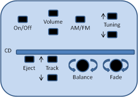
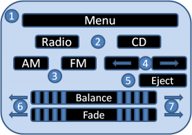
The drawing below on the left represents and typical audio control panel in a car. The drawing below on the right represents what future ones will undoubtedly look like whether we like it or not. What’s the difference?
In the example on the left, you can turn the audio system on or off with the push of one button. You can select AM or FM by pushing one button. You can scan or seek stations with the up and down Tuning buttons, stick a CD in, adjust the balance and the fade and the volume. Very simple, very straightforward, all functions visible and easily controllable.
What about the example on the right? First you have to find the audio system menu. Then select radio. Then select AM or FM. Then go back to the top menu to select Balance or Fade. The CD track previous and next buttons do double duty as the radio tuning down and up functions. And you can’t even find the volume control! Functions invisible without detailed knowledge of how the system works, or lots of trial and error or practice, and control impossible to achieve without multiple actions to get to the right places.
Do you call this progress? It violates all of the principles in Donald Norman’s book The Design of Everyday Things and everything I taught to design engineers about human interfaces. I think you’d be much more likely to have an accident trying to adjust your radio using the example on the right than the one on the left.
What’s this got to do with marketing, you ask? A lot, as it turns out. If you try to cram too many messages into your marketing communications vehicles you are only going to confuse people and make it much more difficult for them to reach their buying decisions. Clear, concise, easy to understand single messages — Save, Get, Solve, Gain, Avoid, etc. — are much more effective. Pointing out and even repeating a single benefit in multiple ways is preferable to including a laundry list of features just because the technology let us do that.
Does this make sense? Let me know what you think. I’d love to share your insights and experience with others and I’m sure they’d enjoy reading about them.


