Version 1.0

Version 1.0 IllustrationI have to say that the number of comments I’ve received about my posts about the WOW customer experience has been gratifying. Some comments have related to the need to get things to market now and letting quality and functionality follow, which I find incredibly short-sighted in the majority of cases, while others have agreed with me about the need to get things right the first time if you want to avoid headaches in customer support down the road or the actual failure of your company due to bad product reviews.

The best comment, however, came from my good friend Peter van Geijn in Munich, Germany. His company sponsored my seminars and workshops in Germany in the 1980s and he recently reminded me of the story I used to tell about Version 1.0.  It goes something like this…

Did you know that the only people who never miss a development schedule milestone are software design engineers?  That’s right, software engineers. If today was the day they were supposed to deliver the product, today is the day that they will deliver it. It will be called Version 1.0.

It will be missing a lot of the originally specified functionality, of course, since there was no time to implement it all during the unrealistic management-dictated, all-too-short schedule, but it will be delivered today.  As Version 1.0.

It will also like contain a large number of “undocumented features,” known in the old days as “bugs,” that will have to be addressed in a future version release. But it will be delivered today. As Version 1.0.

Marketing and sales people hate Version 1.0 because it makes selling the product successfully more difficult and causes customers to complain to them — a lot. It also makes it difficult to get early testimonials and delays the purchase of large quantities of the product until the bugs are worked out.

Designers don’t mind. They keep cranking out new code and patches for the bugs. Sometimes it’s great job security and other times it isn’t. If it isn’t there’s always the next product for the next company to be developed.

Customer support managers love it for the job security reasons as well — subject to the risk of no job at all if the product can’t be fixed in time to save the company.

If the product was developed with OPM (other people’s money), top management will get rich in any case and move on to start another company where they can dictate another unreasonable schedule for a product that must do everything, cost nothing and be done yesterday. It is called Version 1.0.

I’d love to hear your experiences with products that fit this mold. Please share them and thanks for reading.


Creating the Customer WOW Experience

I am flabbergasted. Incredulous. Blown away. Still in shock.

I  just came from a meeting of 50+ people who listened to four very bright and sincere customer service/customer support representatives from start-up companies in Portland talk about how they create the customer WOW experience when confused, disgruntled, frustrated or just plain mad customers call in because either they can’t use the product the way they want to or the product doesn’t perform as advertised or something else has gone awry between product functionality and customer expectations.

Hold the phone here, please! Why is customer support charged with creating the WOW experience? Why is top management charged with forecasting how many customer support people will be required based on sales volume? What if — and this is a revolutionary concept, I’ll admit — the product actually worked when it was delivered? What if it had a logical “idiot proof” set of controls or an error-resistant operational flow?

During the meeting I was taken back to my days in the 1970s when I taught electronic engineers how to design circuits to be easier to manufacture, test and service.  In fact I wrote the first book on that subject — Design for Testability — and later authored Managing Concurrent Engineering, a tome that proselytized the simultaneous design of a product so that it functioned as designed, could be economically duplicated in manufacturing, could be tested thoroughly to be fault free when shipped to the customer and could be serviced quickly and economically when it did fail.

When trade-offs had to be made between product functionality and the “-ilities,” product functionality almost always won out. In fact “feature creep” was one of the key problems that caused delays in getting products to market. But product functionality testing, or design verification as it was called, was held in the highest regard because the cost of shipping something that didn’t work as advertised could be huge enough to put a company out of business long before it could fix the problems in the product.

As I sat down to write this I noticed that Casey Wheeler had shared Seth Godin’s blog entitled “What’s in the box?” in the Oregon Entrepreneurs Network group on LinkedIn and that Michael Temple had commented on it by quoting Guy Kawasaki in The Art of the Start as follows: “… too many start ups try to work out ALL the bugs before taking their idea to the market. The only way to know if what you have to offer will work is to get it out there. Correct the mistakes as the feedback comes in. In time, you will perfect what you are trying to develop, but you will need the public’s help to identify what needs to be corrected.”

Well I beg to differ with Mr. Kawaski, folk hero to so many product developers as he may be. Because product development teams following his advice are the reason that four customer support people are still holding meetings like this for 50+ people audiences 40 years later! It is incredible. Shocking. Deja vu all over again for me. I’ll repeat my earlier question: What if the product actually worked?

I’ll be the first to admit that perfection is nigh impossible to achieve in a first product release. And that there comes a time when you must declare the product finished and get it out into the marketplace. But if you know it has issues, sell it initially to early adopters smart enough to work around those issues, not to the non-techie masses who need customer support people trained not only in solving product problems but in dealing with frustrated customers as well. Can we at least think about these issues early on in the development process?

OK.  Got that off my chest. I think. I have lots of stories about getting things right the first time instead of doing them over again. Including Deming’s story about the Japanese and the American companies making toast. I’d be happy to discuss my opinions on this subject anytime and welcome your comments. What do you think?


Keep It Simple, Please

I just saw a commercial for a new car (whose manufacturer shall remained unnamed – but it begins with a “C”) that talked about integrating all of the functions that used to be discrete buttons, knobs or slider controls in the car into a tablet-computer-like interface. And that reminded me of my old electronic design for testability preaching days where two of the key tenets were control and visibility.

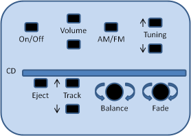
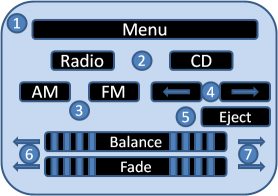
The drawing below on the left represents and typical audio control panel in a car. The drawing below on the right represents what future ones will undoubtedly look like whether we like it or not.  What’s the difference?


In the example on the left, you can turn the audio system on or off with the push of one button.  You can select AM or FM by pushing one button. You can scan or seek stations with the up and down Tuning buttons, stick a CD in, adjust the balance and the fade and the volume. Very simple, very straightforward, all functions visible and easily controllable.

What about the example on the right? First you have to find the audio system menu. Then select radio. Then select AM or FM. Then go back to the top menu to select Balance or Fade.  The CD track previous and next buttons do double duty as the radio tuning down and up functions. And you can’t even find the volume control! Functions invisible without detailed knowledge of how the system works, or lots of trial and error or practice, and control impossible to achieve without multiple actions to get to the right places.

Do you call this progress? It violates all of the principles in Donald Norman’s book The Design of Everyday Things and everything I taught to design engineers about human interfaces. I think you’d be much more likely to have an accident trying to adjust your radio using the example on the right than the one on the left.

What’s this got to do with marketing, you ask? A lot, as it turns out. If you try to cram too many messages into your marketing communications vehicles you are only going to confuse people and make it much more difficult for them to reach their buying decisions. Clear, concise, easy to understand single messages — Save, Get, Solve, Gain, Avoid, etc. — are much more effective. Pointing out and even repeating a single benefit in multiple ways is preferable to including a laundry list of features just because the technology let us do that.

Does this make sense? Let me know what you think. I’d love to share your insights and experience with others and I’m sure they’d enjoy reading about them.